 |
A cover format peculiar to Marvel Comics during the pre-1968 Silver Age was the concept of split covers. Where books had two featured strips inside, the cover art was divided in two to showcase both characters. |
|
The reasons for this were largely contractual, as noted in the History section, but it forced the cover artists (usually Jack Kirby) to come up with inventive ideas to make sure all the characters got their share of cover space. |
|
Eventually, this cover format was phased out in favour of alternating between the characters as cover stars month by month. But I have a real fondness for 1964's thirty or so covers that used this concept. |
|
Tales of Suspense 60 (1964)
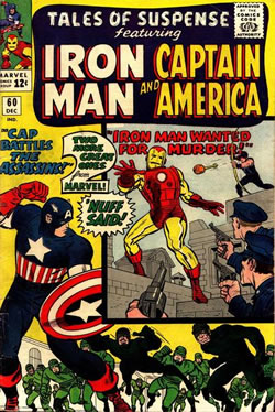
Especially good design coupled with iconic figures of Captain America and iron Man make this one of the best examples of the split cover.
|
|
Tales to Astonish 67 (1964)
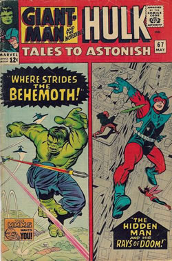
Though the design is less imaginative here, the figure of the Hulk was reused extensively by Marvel and became one of the most recognised images of the Hulk. |
|
Strange Tales 130 (1964)
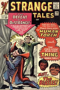
This cover was interesting as it had a Jack Kirby illustration of Dr Stange, a character more associated with Steve Ditko, and comic depictions of the Thing and the Torch. |
|