During the same era at Marvel Comics, their covers began by using formats and concepts similar to their more established rivals. The earliest Marvel covers used lots of explanatory speech balloons. But pretty quickly, Marvel got rid of the expository text and went for covers that spoke for themselves. Comparing the two Fantastic Four covers below is an object lesson in how similar situations can be handled so differently. Marvel were particularly comfortable using the sort of symbolic covers that had been so popular during the war years, something that DC would never have done during this early Silver Age period.
     
Fantastic Four 5 (1961)


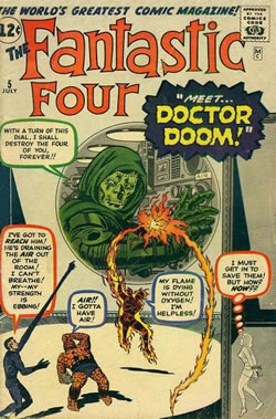
Pretty wordy, right? Does every character have to speaking? And how tiny the main characters are. All in all a pretty poor cover design.
  Fantastic Four 23 (1964)


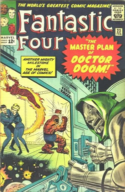
This is more like it. The Fantastic Four are still quite small, but easily recognisable. No unwieldy text cluttering up the artwork. And you can immediately see what's going on.
  X-Men 4 (1964)


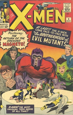
Obviously Magneto and his chums aren't really twenty feet tall, and Marvel were happy to trust the readers to realise that.
 
           
<< Previous Page  
  Next Page >>  
     
 
Copyright © 2008 The Story Works | Contact | Other sites hosted by TheStoryWorks