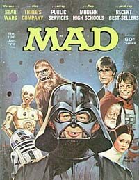
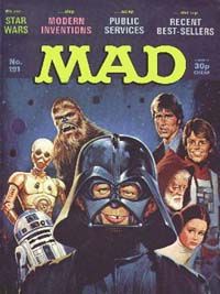
Here you can see the US edition of Mad on the left, with the subsequent UK edition on the right. The variation in colouring is more a product of the scanning than the printing. Note how the actual painted artwork on the US version goes right up behind the logo and the cover lines.
With the UK edition, we had to cut the top third of the US cover away, then add our own logo and cover lines. To disguise the change, we laid a dark blue background behind the new logo and text, trying to match the overall colour of the original painting as best we could.
This kind of "bodging" was a regular occurence on Mad magazine, both inside and out, but it afforded me a very rapid education in the important role both production and editorial play in the publishing of a regular newstand magazine.